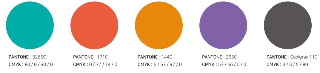
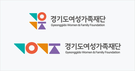
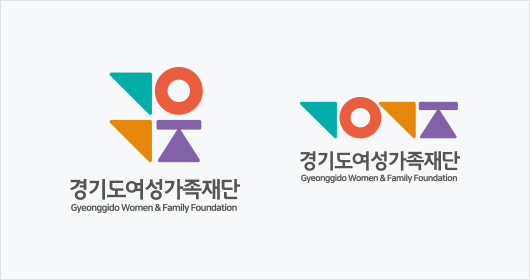
The GWFF’s logo is made up of stylized versions of the Hangeul consonants that make up the GWFF’s Korean title and come together to form a scale and standing woman. The colors represent, respectively, the ideals of: communication and respect, growth and innovation, living together as a community, and gender equality. The logo is a symbol of the GWFF’s role and vision of creating a gender-equal society that is free of discrimination and in which everyone can live fulfilling lives through communication, growth, and innovation.
Signature
Signature
“Making Gyeonggi-do stronger through equality” reflects the GWFF’s commitment to building a close-knit community by having Gyeonggi residents participate in the work of building an equal society with no discrimination or violence.
Download Slogan